Studio

A brand identity grounded in direction and flow - Studio Meridian creates systems that feel centered, adaptive, and enduring.

Volume is an exercise in rhythm, built to feel intentional and enduring.

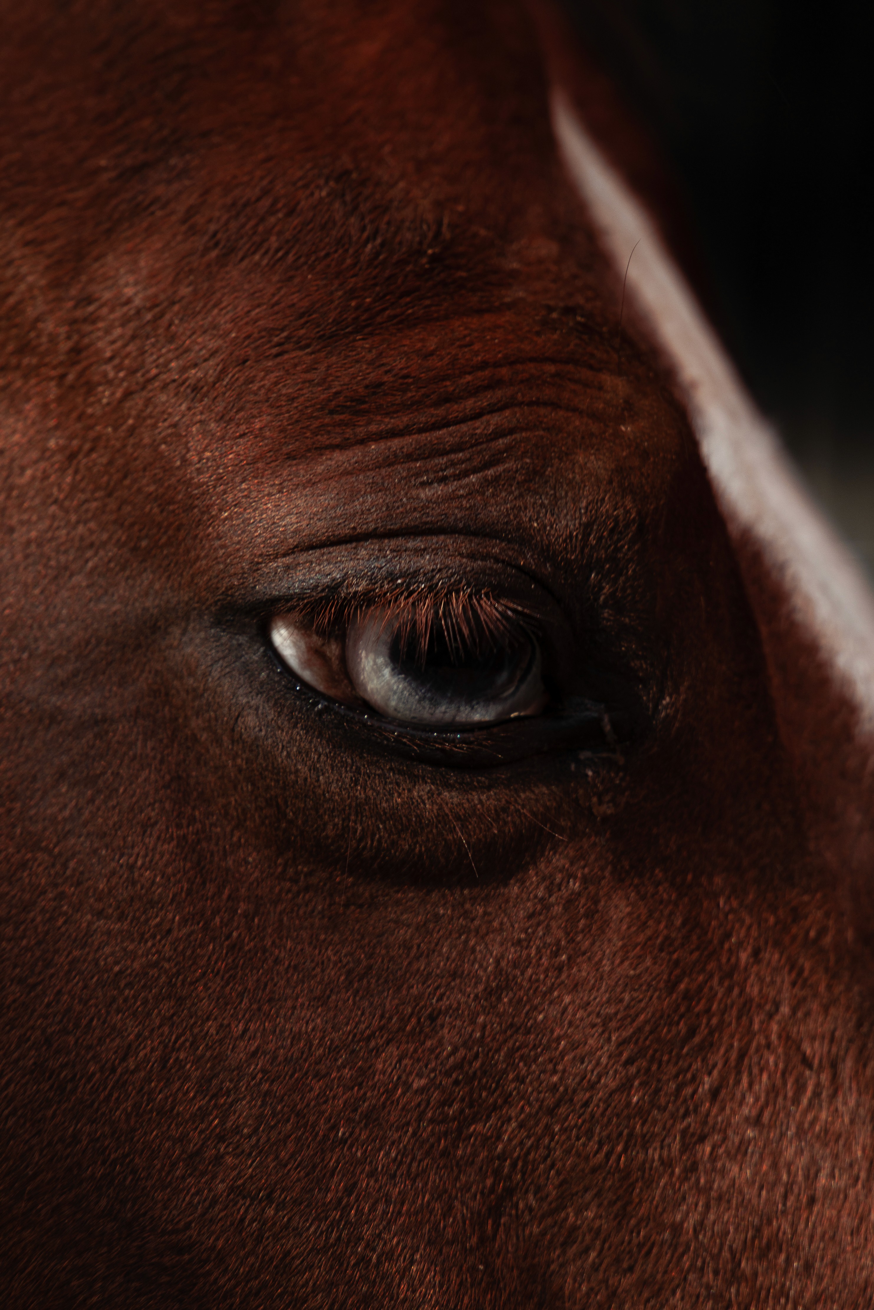
Horse eye
Horse man

(about the project)

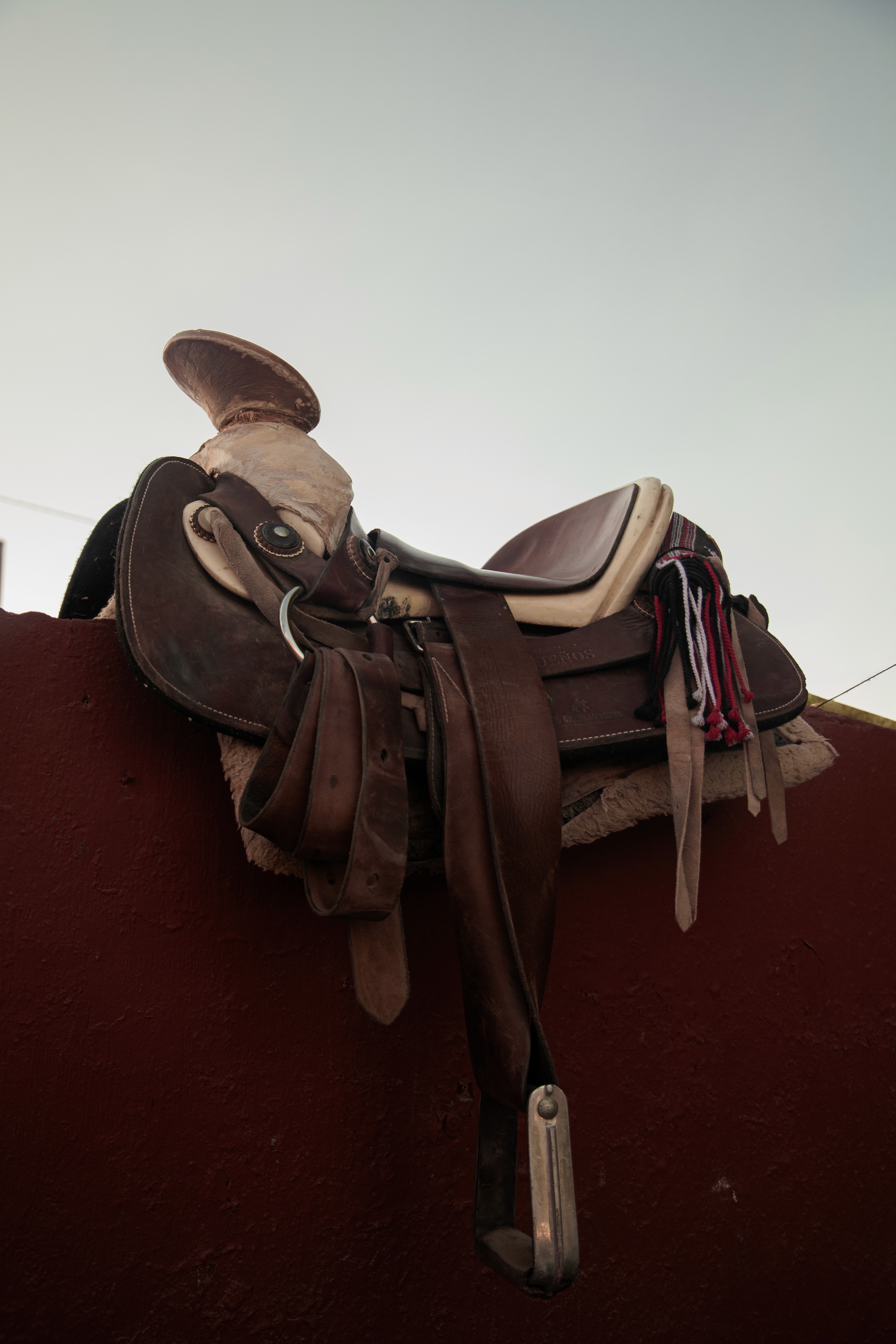
Studio Meridian explores the idea of alignment. The project builds a brand framework where identity is guided by rhythm, proportion, and flow. Inspired by the balance of a meridian line, the design language reflects both stability and adaptability. Typography, grid, and imagery are orchestrated to create a voice that feels precise yet fluid — a system built to evolve without losing its center.
Two horses
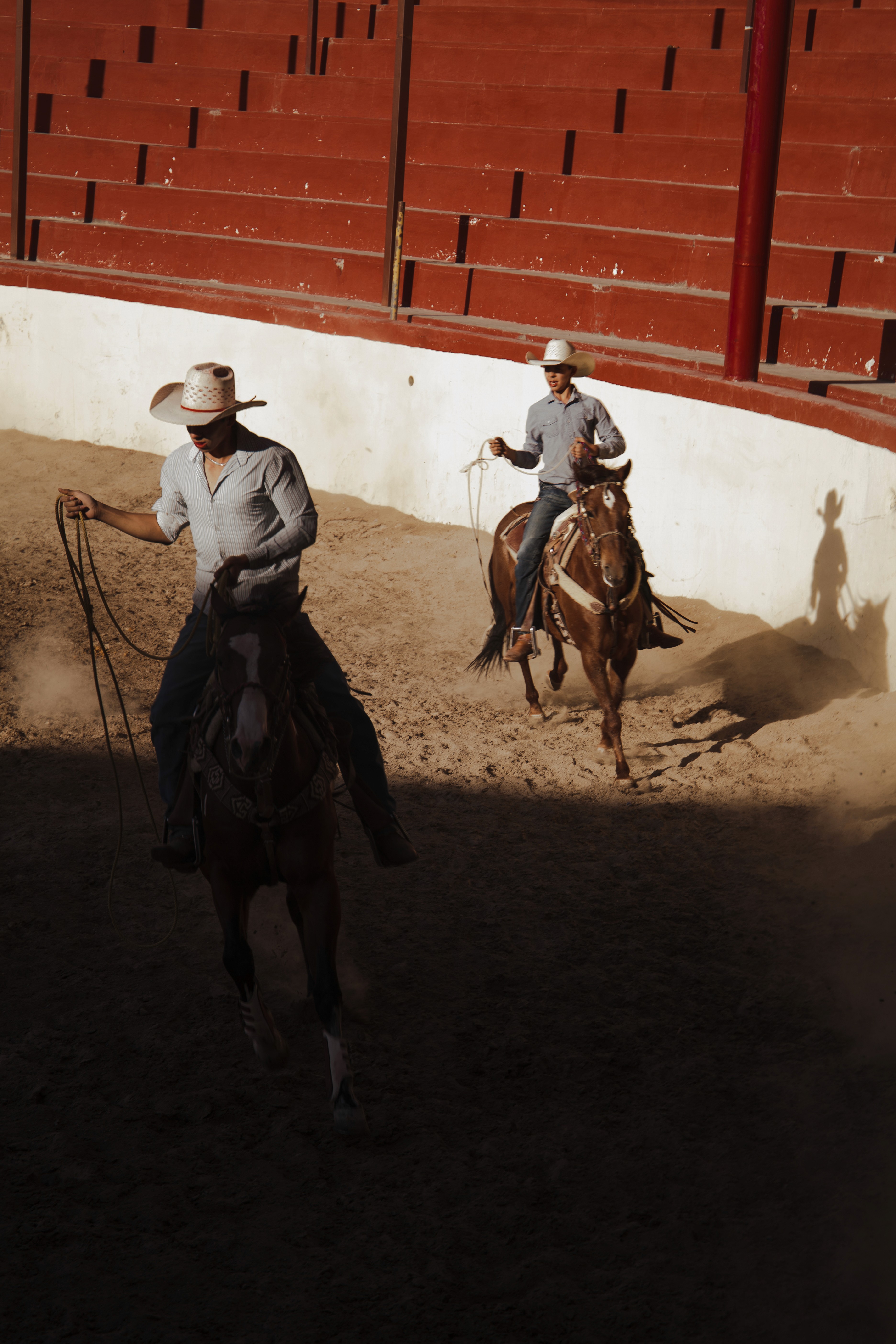
Two horses
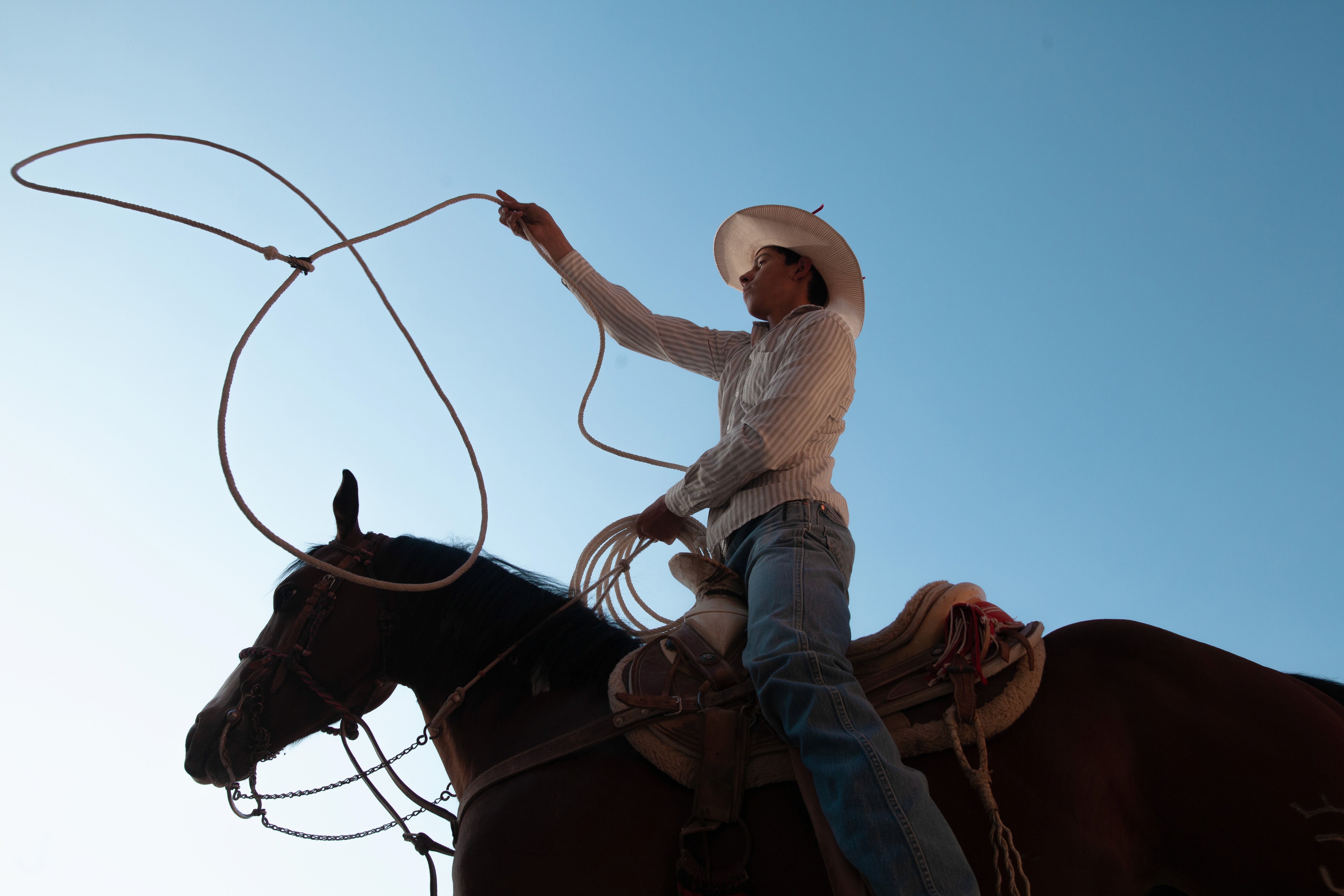
Guy on the horse
Running horse

(industry)

Design & Culture

(Date)

November 23, 2023

(client)

Studio Meridian

(scope)

Brand Identity, Creative Direction, Visual Systems
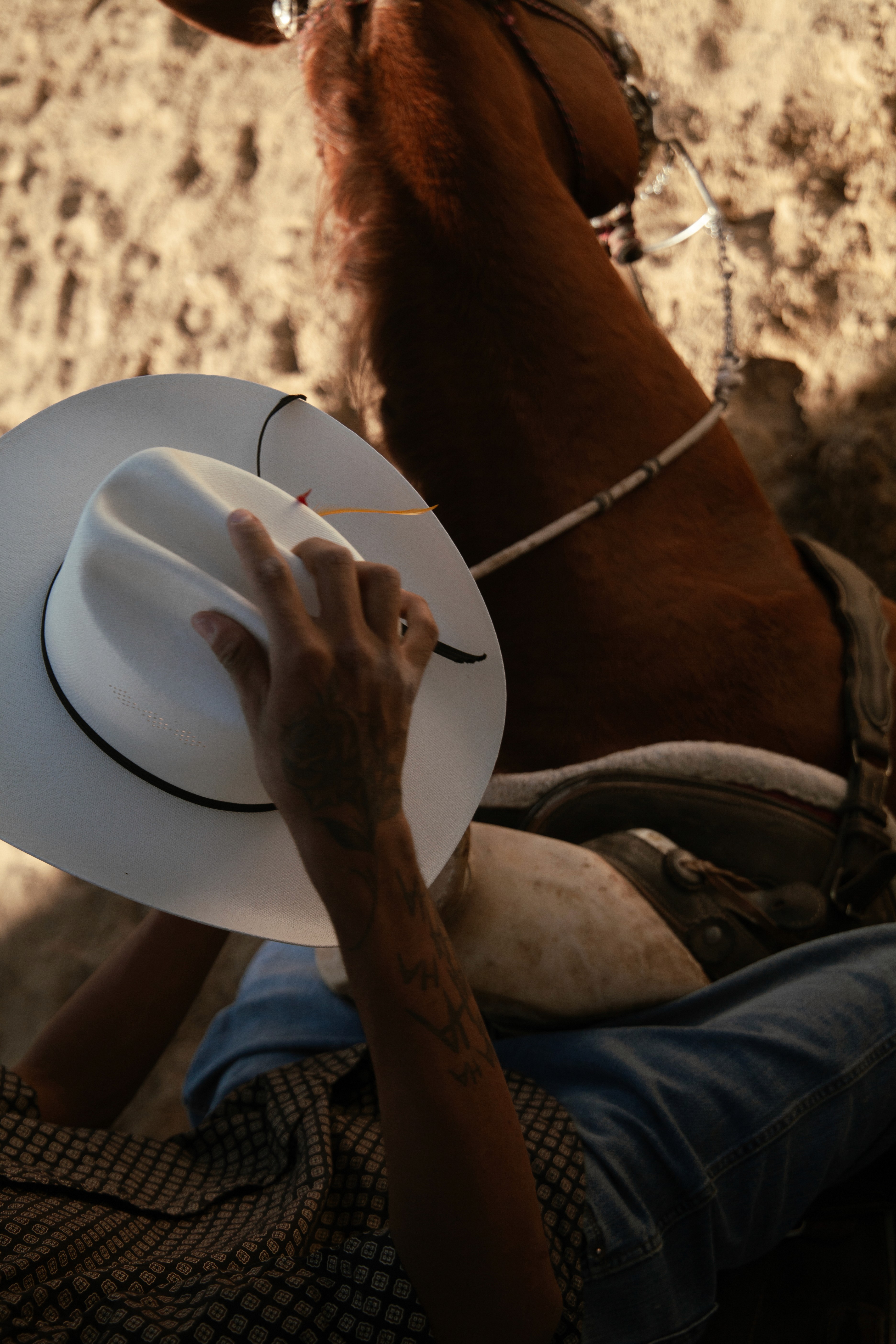
Hat boy
Brown and sky
Three boys

(next project)

An editorial framework in rhythm — Parallel Lines explores balance, repetition, and clarity through typography and grid.

1:54:29 AM

Toronto, ON

1:54:29 AM

Toronto, ON

Contact me!

From first sketch to final frame, I treat design as translation - turning ideas into systems that feel timeless. If that’s the kind of work you’re looking for, we should meet.

Contact me!

From first sketch to final frame, I treat design as translation - turning ideas into systems that feel timeless. If that’s the kind of work you’re looking for, we should meet.

Contact me!

From first sketch to final frame, I treat design as translation - turning ideas into systems that feel timeless. If that’s the kind of work you’re looking for, we should meet.